With the release of iOS 13 and Android 10(Q/R), comes a new adventure of dark mode in mobile apps. There are two main aspects to implementing dark mode in xamarin forms:
1. App theme identification (i.e if it’s light or dark theme)
2. Implement the light theme and dark theme (using xaml styles)
1. Theme identification
To identify whether the app is running as light theme or dark theme, we use xamarin Essentials AppInfo. First we need to create a function that will set the theme. This function will be placed in the app.xaml.cs when the app starts and resumes as shown below.
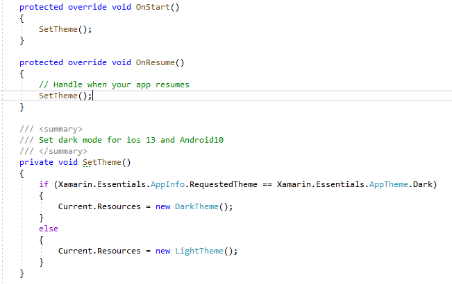
If the requested theme is not returning the correct theme for iOS, ensure you do not have the UIUserInterfaceStyle set up in you info.plist. This is also the way to opt-out of dark mode implementation if you are not ready for dark mode implementation yet i.e set the UIUserInterfaceStyle key to Light.
<key>UIUserInterfaceStyle</key>2. Theme implementation
Now we need to implement the different themes. First we create a folder named styles. In this folder, we create three classes namely, default theme, dark theme and light theme xaml.

Default theme
The default theme class will have any prior styling that was contained in app.xaml file.

Dark Theme
The dark theme file, will contain any dark-specific styling such as colors

Light Theme
Similarly, the light theme file will contain any light-specific styling such as colors.

Combining themes
Now we just need to merge the dark or light themes with the default styling. This can be done by through MergedDictionaries as shown above. When the app theme changes, the correct theme will dynamically be applied through the use of dynamicResource attribute.
Updating Icons/Images
There are couple of ways to transition images to dark mode. One option, is to use another set of completely different images designed specifically for dark mode. Once imported into the solution, explicit styles can be used to switch between dark and light images using dynamic resource rather than static resource. However, there are a few issues with this implementation as outlined below:
- Another set of dark mode images increases the overall app size.
- For each image that needs to be switched between dark and light mode, explicit styles or converters have to be created which can be tedious and a nightmare to maintain.
Another option which does not have the above drawbacks is using an effect to change the tint color of images
Difficult Xamarin controls
Most Xamarin controls are not complicated and smoothly adhere to dark/light mode switch. However, for some controls such as Entry and search box this was not the case. For Entry control, we can simply set the Visual property to Material and this will fix the problem. This requires adding Xamarin.Forms.Visual.Material Nuget package which has other advantages such as creating a unified look and feel between iOS and Android as described in Xamarin Forms Material Visual.
Search box is even more tricky as it has magnifying search icon and close icon. For Android, setting the background color to a dark color when in dark mode will frame the search box but the icons will still be almost invisible. To update the icon color, we use tint effect
Status Bar Color
The status bar color seems to work out of the box for iOS but not for Android. To update the status bar color in Android, we create a custom renderer that will acquire the current activity window and set status bar color as described in dynamically change the status bar appearance in xamarin forms
 Xamarin Forms blogs